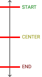
align-items:
align-self
justify-items:

grid-template-(rows/columns): 1fr, 2fr...;(fr,px,%,auto)
grid-template-areas:
"head head head
nav main main
nav main main"
grid-area: head/ nav/ main;
1.) align-items/content: start;
2.) justify-items/content: center;
= place-items/c: (1.align-items/c) (2.justify-items/c);

If flex dirrection is column - switch pictures.
Circled words are ussed most common to position in center.
1.) flex-grow:1 (take all space)
2.) flex-shrink: 0 (item will be smallest) / 1 (all equal) / 2 (will stay as largest item)
3.) flex-basis: auto (same as all) / 0 (small as possible / 10px
= flex: (1.grow) (2.shrink) (3.basis)
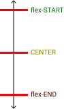
1.) flex-dirrection: row / column
2.) flex-wrap: no-wrap / wrap
= flex-flow: (1.flex-dirrection) (2.flex-wrap)
order: 0 (default)